Saturday, August 22, 2009

Stippling: Pen and Ink Dots and Crosshatch


Stippling is an ink drawing technique where you apply various tones and textures with small dots. You can adjust the depth of tone and the roughness of texture by varying the density and distribution of the dots. Like cross hatching, stippling can take on many forms. It can be done free handed or mechanically on your computer. Using carefully or loosely arranged dots of even or uneven densities and distribution. Any small marks, not just dots are good to achieve the stippling effect.

Cross hatching is another pen and ink skill this is often combined with stippling to create depth in the artwork. These are two traditional techniques that have been used by artists for centuries. As strange as it sounds stippling all comes down to specific dot placement. This may seem confusing since it looks so random. When doing a pen and ink drawing I always begin with a light sketch in pencil. I make sure it is perfect and then I transfer the main outlines to an inking surface using graphite transfer paper. I usually use hot press water color paper when doing an ink drawing. It has a smooth durable surface. This paper is good cause it can withstand many lines and ink dots in a small amount of space. Make sure to keep your paper protected, smooth and undamaged. This could effect the way your ink lays on the paper. Now if you are a beginner, regular pens are OK, but you will find as you progress that you may prefer a more technical pen. Then don't blot like a regular pen, or catch the paper, creating possible smudges. Ink does not erase so something like that can force you to start over. Not fun. Pigma Micron pens are good to use, they are inexpensive and widely available.

As far as actual technique goes, I make the ink lines in combination. The first technique is called cross-hatching: small groups of parallel lines are drawn at angles to each other, and are drawn on top of each other, so that shading results. The more lines placed in one area, the darker the shading. I use this technique quite a lot; I find that it is fairly easy to control the buildup of lines, and therefore the amount of shading. Another technique is called "stipple". Tiny dots of ink are used to indicated texture and/or shading. Stipple is an extremely time-consuming technique, since each dot must be carefully placed to avoid the appearance of "pattern" where there may be none. With pen and ink, building from light to shadow is key. You can add color afterward. Accomplishing that with lines only is a unique challenge. One other thing I'll mention is this: there are no outlines in nature. Realism in pen and ink (and in any other medium) depends on approximating as closely as possible what is actually seen, and not what you think is there. But, this is the ultimate charm of pen and ink and why it hold such fascination for 
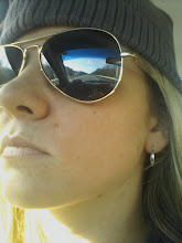
me: images can be made to look "real" through the use of texture and careful shading, yet still retain a certain unrealness by virtue of the fact that the image is made up of nothing but lines. As you can see to the right it also may help to section off your original picture. Since you are working with dots and not objects, you can now use your eye to go space by space collecting all the information of one before moving to the next. It makes it just a little easier, to keep you from getting overwhelmed by the mass large picture. You can practice this technique just by drawing and shading simple shapes. Notice how and where the light bounces of the objects you are drawing. Have fun with it.

Acrylics: Selecting Your Colors


Being that acrylics are relatively new, the color manufactures have been able to use the best new pigments. Lightfastness is important (a pigments ability to withstand fading). Good lightfast colors include Quinacridone violets and reds; Phthalo blues and greens; Cadmium reds and yellows and also Azo Yellow. There are also white metallic colors available. To understand how colors work together to create different effects, you should be aware of the basic color theory. You three primary colours are red, yellow, and blue. These can be set up with related colours in between thus setting up your colour wheel, adding your secondary colours, violet, orange, and green to conclude it.

This colour wheel shows the three primary and three secondary colours. The secondary colours are easily obtained by mixing the two primary colours that are on either side of it. I have also added some colours in between to show a more gradual shift from one color to the next. I have added a bit of white paint to my colors to make them opaque. The colours I used here are naturally a little transparent. With these fairly pure paint colours you can mix almost any hue.

Experiment at first with a limited palette. This will give you a more individual experience of mixing colour and tone with just a few basic colours. Maybe start by picking just three primary colours and white to add value. Make sure to remember that every colour you add to a painting is going to effect any other colour on that page. Mostly those touching it and right next to it. It is best to use complementary colours to interact with each other when ever possible. It helps to produce a bright contrast and overall balance. Complimentary colours are those that appear across from each other on the color wheel. Green and red, yellow and purple, orange and blue. Aim for balance when trying this, if a painting is predominantly blue, only a few touches of orange are needed to intensify the blue.

Adjacent colors are also those colours right next to each other. When painting a flower red you can use the cooler and warmer shades of that red to add your highlights and shadows. It will give you a more gradual transition then adding black or white. You can use the adjacent colour violet for the deeper shadows and so on.
Check out my painting of the archer to see how I experimented with the colours on the wheel. This is a good exercise to help you with your understanding of colour. Just continue painting the same picture over and over using different contrast of the colour wheel. Also be sure to do one in full colour. You can paint something more simple, like a flower. Here is what I did: For six of the squares I took all of the main colours of the wheel and used that colour with only black and white to create the shading and tones. Square one is just red black and white. Then I took the 3 primary colours and used there contrasting colours to create the same image, remember only these two colours. Like in square 2 there is only orange and blue, no black or white was added for shading. You will find these to be a little more difficult to master. Don't worry, as you can see mine are far from perfect. For the middle one in the bottom row I used full colour. Practice this a couple of times. You will find that they get better and better as you further understand the colours you are using.


Thursday, August 20, 2009

Drawing: Hands; Tips to Drawing Them


Hands are one of the three expressive body parts that are key in depicting a subjects mood. In other words you should spend almost as much time drawing a persons hands as you do on there face. Don't hesitate to draw them, most beginning artists tend to hide them in pockets or behind things. It takes study, a good eye, and practice, but you can learn to construct a fairly convincing hand if you understand there basic form and underlining anatomy. Understanding the components of the hand; bones, muscles, and tendons, will also help you to draw believable hands.
If you find it hard to draw human hands, don't despair. Not many people find it easy. They always seem to come out looking cartoonish or misproportioned, usually both. Like everything else, it helps to first break them down into simple shapes, again whatever shapes suit you best. Fingers can be broken down into rectangular sections, palms into squares, and so on. Some people prefer other methods, such as simple line drawings to start. I like to think of the hand as three big pieces- the palm, the thumb, and the fingers. Imagining the hand as a mitten, with the fingers grouped as one. Then in your mind convert the mitten into a more 3-D form. The hand is long and generally flat, only the folds of the palm and joints of the fingers make it seem so complex. The fingers have three joints, the knuckles, the middle and the tip.
Here are a few tips to always remember when you are drawing the human hand:

There is a space between fingers. There should be a kind of webbing or 'U' like shape between them.

All hands have three meaty parts. The row or as I call it 'pad' below the knuckles, one right below the thumb and the third is right across from it. Think about which one of these will take up space in any particular hand pose.

Always remember that fingers do not relax into straight lines. They will always have a curve to them no matter how gravity is pulling.

Not every bit of each finger will or should show.The trick is to use your eyes and figure out which fingers stick out and which are covered by part of the hand and other fingers.

And another common misconception, your knuckles do not line up. When you clench your hand together your fingers wrap around the meatier parts. This will make the index and middle finger stick out further then the other two.


Drawing: The 5 Basic Shapes


Want to learn how to draw but don't know where to start. Well let me show you how to draw almost anything with just five simple shapes. You can learn to draw almost anything you want to and continue to carry an increasing enjoyment for it. Almost everything you see around you, a house, a face, a glass, a boat, mountain, tree and so on can be drawn with these following five simple shapes. All you need is a square, circle, triangle, rectangle, and an oval.

Now when you begin drawing you can use any of the shapes that you desire. You may choose to draw something simple like a flower, some people may choose to start with an oval, and others a circle. It doesn't matter what you choose there is no right or wrong. It is what ever feels good to you. Now practice these shapes. Allowing yourself only a few seconds to lightly sketch each one. Do them many times each time a different size and a different proportion. As they say, practice makes perfect. Now don't worry if they are not exact. These are only going to be used as your basic guidelines. Concentrate only on doing them quickly and lightly. Maybe you have to go over them a few times before they look right to you.

Now for drawing more complex objects. Take a picture of whatever it is you want to draw and break it down into your basic shapes. Draw them lightly to achieve the general outline of your subject. Above you can see how I worked through a rabbit and a chicken, starting with the basic shapes of just some circles and triangles. Notice how all the sketches are less then perfect. That is because these are your practice sketches. They will get better with time. These basic shapes will show you instantly if you have the correct proportions. You will find that if you are not satisfied it is very simple to adjust the size of the basic shapes to your satisfaction.
Many beginners often try to draw a portion of the whole object and find that as they continue adding parts they have incorrect proportions and the object does not look correct. They quickly become aggravated having spent so much time on minute details only to find that it looks funny, or they don't have enough room to finish the drawing. That's why starting with simple shapes is so important for even the more advanced artists. Also by putting down these basic shapes you become enthusiastic as you see your simple drawling slowly coming to life.
Try setting yourself a time limit, maybe 15 minutes to start, you will be amazed to see how working under pressure will improve your ability. It will force you to avoid worrying about stray lines and trying to make it perfect. Instead your brain will pick out the instinctive basic lines that will produce the main shape.
Practicing these exercises continually will help you to draw and see things in a way you never have before. You will begin seeing more and more things as simple shapes instead of the complex combinations of lines and colors you were seeing before. Start looking around the room, picking out objects and deciding what simple shapes make it up. By doing this your starting a process that will teach you how to use your eye to draw. Observation is the key. The more you practice the more your brain will remember making it easier for you to draw in the future.

Wednesday, August 19, 2009

Illustration & Drawing: Perception


One great thing about drawing is that there is no studio or expensive materials needed. Just a pad of paper, a pencil, and your eye for detail. There is really no right tools and only one true requirement, to see.
In drawing it is important to be aware of how we use our eyes in the condustion of our everyday lives. To discover what adjustments we have to make to our perceptual processes to make successfull representational drawings. Now for your first excersise; go to your dinning room table, memorize it, every detail. Now go into a different room and write down a description of everything you saw. You may find it fairly simple. Now return to the room and again write another description. Your second, you shall find is much more ellaboate and finely detailed. Telling stories about individual objects and so forth.
The reson for this is simple, to force you to use your eyes. You first had to use your memory and may have been surprised to see how much you forgot. Then in using your eyes you gathered more info then your memory could hold.
A problem arises when you now try to translate this picture of observation into a drawing. Now draw the table as you saw it. You may find that you come up with something that doesnt really resemble what you know you see. try not to draw it as you wrote it (showing every object as it is indavidually) but as you see it. Make sure you remmeber that your eyes are everything. Most begginers find it hard to draw a table from where they are viewing it. Remember that you need to draw it as you actually saw it. You cant see all of each object. Now take a chair and sit about 9 feet from the table and draw it again. Remembering to use your eyes. Drawing what you see and not what you know is there. You now see how some objects are actually hidden by other objects. You now see how the chair is in front of the table so you cant see all of the table. You may still have the urge to tilt the table top so that you can see everything. Notice that this is not how it is visalbe. Try also to refrain yourself from drawing objects indavidually as a whole. One thing at a time, placing the table and chairs around them.
Remember there is nothing wrong with your eyes or the visual information that you are recieving. The problem is that you are not using the information in a pictoial way. It is not until begginers actually start to make a representational drawing of what he or she sees from a fixed viewpoint that it finally occurs that is is impossible to see an object in its entirety from a that viewpoint. For one, if you were now to move the chair you are sitting in one foot to the right you will now notice from that "fixed viewpoint" all the spaces and viewable areas of the objects in front of you have changed. From point one you may have been able to see a flower vase and now that you have moved to point two you may be able to see the cup that was sitting behind the vase, not visible from point one. You will always be fighting against your precieved experience of an object as distinct from your actual view of an abject when you start to draw.
We recieve way to much information through our eyes. Therefore we have to be selective when drawing, using only the visual information that can be recorded through a fixed viewpoint to draw. Selecting only the most useful things to develope our pictorial representation. Its not about seeing better, but seeing more selectively. Do not expect to be able to comprehend all of the asspects of drawing at once from the beggining. I will further outline several theories associated with representational drawing such as perspective, light, shade, tone, and so on. Try to avoid learning the steps in isolation. Work on your perspective, but make sure to use subject matter that is familiar to you, like your house, or your table. Something you have basic knowledge of. Also it is always better to draw directly from life. Try avoid using photographs and drawings because here the 3 dimensional world has already been changed to a 2 dimentional project. Our main purpose is to train you how to transfer the 3-D world you see to a 2-D flat form. Leave the photograph drawing till later, after you have practiced drawing from life. Practice makes perfect and first hand expierience is the finest teacher. Theories are useful-if kept in their place. You already posses all the tools to draw.

Name Wall Art - Full Name


Here are some examples of my name wall art. Each done on a 8" by 10" piece of canvas. Just giving you an idea of what can be done. There are a few simple steps to follow:


First decide on a theme. Any theme you decide can be done. May it be the theme of your room, your favorite sport or past time, or maybe its a lifestyle, like western or rock. The imagination is endless so don't be afraid to use it.

Second you need to pick a font. Almost any font is possible, with in reason. If you cant decide on a font to you I have no problem trying to match one to your theme.

Third I need to know what colors you want, if your not sure then your room colors or favorite colors are a good start. A picture of your room and or your bedding are also great things you can offer up to help me choose the best colors if you are having trouble.

Fourth I need to know about what size you would like it, any picture size will work. This way I can frame it. If you do not want it framed then your options are endless. I also need to know if you are wanting to hang it vertically or horizontally.

Finally, the pricing does vary on these. Ranging anywhere from 15.00 and up depending on size. Best way to find out more is to email me at amywacker@yahoo.com with your size idea and frame preference so I can give you an exact amount.

Now remember each one of these is hand painted and does take a lot of time so the sooner I have your order the better. In case I have many orders at one time.

Tuesday, August 18, 2009

Acrylics : The Basics


While somewhat new to the painters world, acylics are becoming more and more popular due to their flexibility suitable for a wide range of techniques. Giving this medium huge potential. They are also much cheeper to work with then your standard oil paints. Good for the begining painter.

In Useing acrylics straight out of the bottle without adding water it is called opaque, it is ideal for even flat coverage, or for very thick effects. Usually you get highly visible brush strokes when using opaque acrylics. Interesting paintings can be built up quickly due to the fast dry time. Mistakes are easily covered due to fast dry times.

Acrylics are largely water based. Meaning there are no toxins to go along with them as in your oil painting. One down side of acrylics is that they dry soft, meaning they can attracked dirt. Some people call this a film. It dulls the colors of your painting. Most art store acrylics do not have this problem.

Different Ways To Use Acrylics:

Opauely: Useing acrylics straight out of the tube. Applied thickly, sometimes adding white. This is important when painting on a toned surface.

Plastic Properties: When it dries, these paints take on a tougher quality of plastic. This makes it unique among painting media because it can be extruded, knotted, or sculpted in 3-D form.

Acrylics As Glue: Its almost like a fast drying glue. Because of this, it works well in colloge techniques. Using lite materials and thick amounts of paint.

Watered Down: Diluted, it can be used like watercolour. It has the advantage of drying insolubly so that layersof paint dont mix with lower layers. Diluted, they also work well in an airbrush.

Painting With Texture: You can create highly textured effects with thick, impasted paint by mixing special pastes into your paint. One coarse paste includes pumice.

Painting With Gel: Gel medium offers you a choice of effects. Alot of gel w/ little paintcreates a translucent impasto. Scraped or painted thinly gels will create a translucent glaze.

MEDIUMS are substances that can be added to paint to change its consistency for specials effects as explained above or even to make it have a glossy or more matte finish. RETARDER can be added to actually slow the paints drying time and keep it workable and useful for techniques like blending.

The best colours to use are those that can withstand fading. Good choices include; Quinacridone violets and reds; Phthalo blues and greens; Cadmium reds and yellows; also Azo yellows are good. The earth colours, Ochres and Siennas, and Titanium White.